 CASE STUDIES
 How I Built ImageTools.pro with Next.js and Vibe Coding
My experience building ImageTools.pro, an online image processing app powered by Next.js, Sharp.js, and Shadcn UI, and how AI changed the way I build web apps.
Read Article
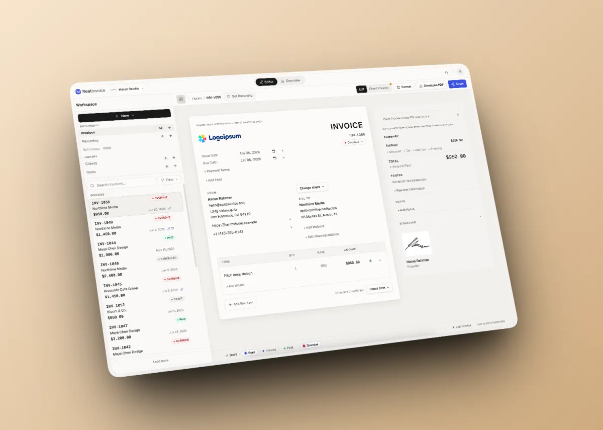
NeatInvoice is a SaaS product I built at Harun Studio: an invoicing workspace for freelancers and small teams in the global market. It is not a one-off PDF generator, not enterprise accounting software, and deliberately not a generic AI dashboard.
If you have ever built a web product, you probably know the feeling: features keep getting added, but without clear positioning, the product starts to look like everything else already on the market.
With NeatInvoice, I started from the opposite question: what problem do existing invoicing tools still not solve well enough?
In this article, I will walk through how the product was designed: the problem I wanted to solve, the positioning I chose, design decisions, the features I built and why, and the technical approach behind it.
Before going into detail, here are the main points I want to emphasize:
Want to build a SaaS product with a similar approach? Talk it through in a free consultation.
Before writing a single line of code, I mapped three complaints that kept showing up in the freelancer invoicing market:
| Complaint | Why it matters |
|---|---|
| ”I sent the invoice three days ago. Did they even open it?” | After the invoice goes out, there is no signal at all |
| ”I have to manually remind clients every time a payment is late.” | Follow-ups are repetitive and not automated |
| ”My invoicing tool takes longer to learn than my actual work.” | Navigation is too complex; the product’s value gets lost in the complexity |
Behind all three is a deeper pattern: freelancer billing workflows are fragmented. PDFs in one place, tracking in a spreadsheet, reminders in a manual calendar. There is no single billing home tying it together.
Existing competitors often fall into two extremes: too simple (PDF generator with no tracking, no status, no overview) or too complex (enterprise accounting software with long onboarding). NeatInvoice is meant to fill the gap in the middle.
The most critical positioning decision at the start of the project: the homepage sells a workspace, not a PDF generator.
Brand (neatinvoice.app) | Separate route (/invoice-generator) | |
|---|---|---|
| Role | Primary identity: invoicing workspace | SEO funnel: fast PDF without an account |
| CTA | Start free workspace | Generate PDF |
| Goal | Long-term billing home | Entry point, convert to sign up |
I deliberately aimed the brand hero copy at an angle competitors rarely touch:
Your invoice was sent. Now what?
Not “free invoice generator in 30 seconds.” The problem is not creating an invoice. Plenty of tools already do that. The problem is what happens after it is sent: not knowing whether to follow up or wait, and not having one place to see everything still unpaid.
| NeatInvoice | Common alternatives |
|---|---|
| Free forever workspace | 7 to 14 day free trial, then paywall |
| Finance overview + needs attention on Free | Overview only on expensive tiers |
| Live link + view tracking | PDF attachment with no open tracking |
| Local-first editor | Cloud-only, lag when offline |
| Calm, finance-grade UI | Busy templates / AI dashboard aesthetic |
| Honest limits (25 inv/mo free) | Misleading “unlimited” marketing |
What I deliberately do not claim: “AI-powered invoicing”, “all-in-one accounting”, “enterprise-grade ERP”.
Freelancers and small teams (1 to 3 people) in the global market: designers, developers, consultants, writers. Product UI and copy are in English because the market is global.
The job to be done I designed for:
NeatInvoice deliberately avoids generic SaaS aesthetics: purple gradients, glass cards, “AI-powered” badges everywhere.
Internally I call the visual reference “The Trusted Desk”: warm off-white shell, the invoice document centered as the hero, calm chrome. Indigo accent only for Share, sent, and viewed signals. The goal is simple: numbers feel reliable, the invoice document stays the hero, and the overall UI feels familiar like finance-grade products (Stripe, Linear, Mercury).
The most important information architecture decision for UX:
| Screen | Route | Function |
|---|---|---|
| Editor | /workspace | Create, edit, preview invoices |
| Overview | /workspace/overview | Finance pulse, needs attention, revenue trend |
The workspace navbar has only two tabs: Editor and Overview. Overview is not a slide-over panel. It is its own destination route.
The practical reason: freelancers who bill regularly switch between “editing an invoice” and “checking what is still unpaid.” Those are different enough contexts for separate screens, without needing dozens of menu items.
Direct, understated, finance-grade. Copy explains what happens next: save, publish, send, remind. Not startup superlatives. Official product terms (Workspace, Overview, Live link, Needs attention) are not paraphrased casually.
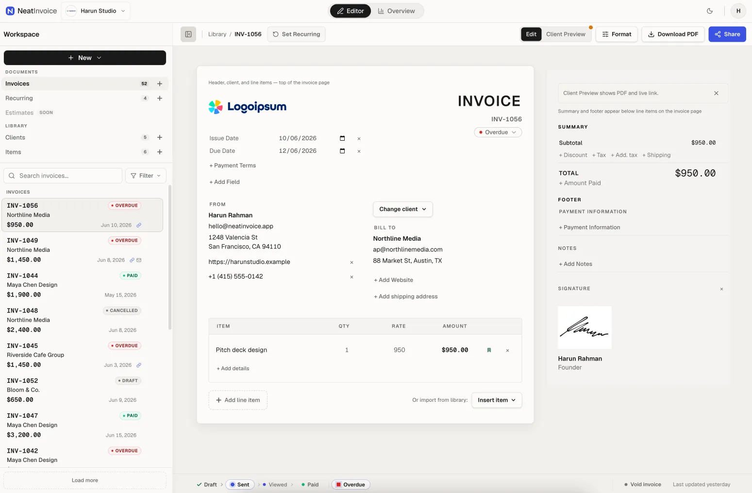
The editor uses a split layout on desktop: 760px invoice document on the left, 380px inspector on the right. The sidebar holds libraries for invoices, recurring schedules, clients, and items. There is Client Preview, a single-column view exactly as the client sees it on the live link. Support for 40+ currencies and 12 locales for invoice labels. PDF exports client-side. Status lifecycle: Draft → Sent → Viewed → Paid, with Overdue and Cancelled as terminal states.
I chose a local-first approach because the editor is daily work and must feel responsive. Edits do not wait on the network; cloud sync runs in the background with honest indicators (idle, saving, saved, error). Guests on /invoice-generator save in the browser; signed-in users sync via Supabase. Client Preview reduces the risk of an invoice looking different when it reaches the client. Client and item libraries speed up repeat invoices without re-entering data.
Core features here:
/inv/[id]) as a read-only page for clients without an accountPDF attachments cannot be tracked. The live link is the main differentiator, a direct answer to “Did they even open it?”
One thing users need to understand: publishing a live link is not the same as Sent status. Drafts can be published for client preview; automated reminders (Pro) require Sent or Overdue status. Keeping those concepts separate prevents wrong expectations.
On the Free plan, users copy a live link and share it via email, Slack, or any channel they already use. Pro adds in-app email delivery with the live link in the body, not a PDF attachment, plus scheduled payment reminders 3, 7, or 14 days after the due date, once per invoice.
Free remains useful without in-app email; copy link is enough for most use cases. Pro monetizes delivery and automation, not UI decoration. One reminder per invoice is intentional: enough to nudge, not enough to feel spammy.
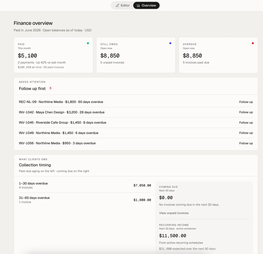
Overview shows:
Each row can deep link to the editor (?invoice=id) or share intent (?share=1).
This is what makes the product feel like a workspace, not just an invoice editor. Needs attention is designed so you know the next step, not just a generic notification feed.
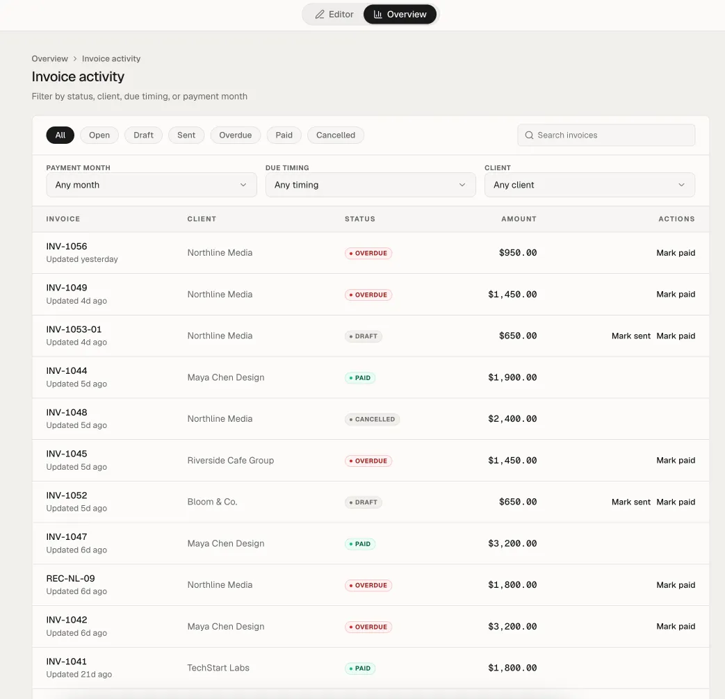
A ledger of all invoices with filters for status, client, aging, and search, connected from Overview without switching apps. Overview is for the daily summary; activity is for audit and deeper search.
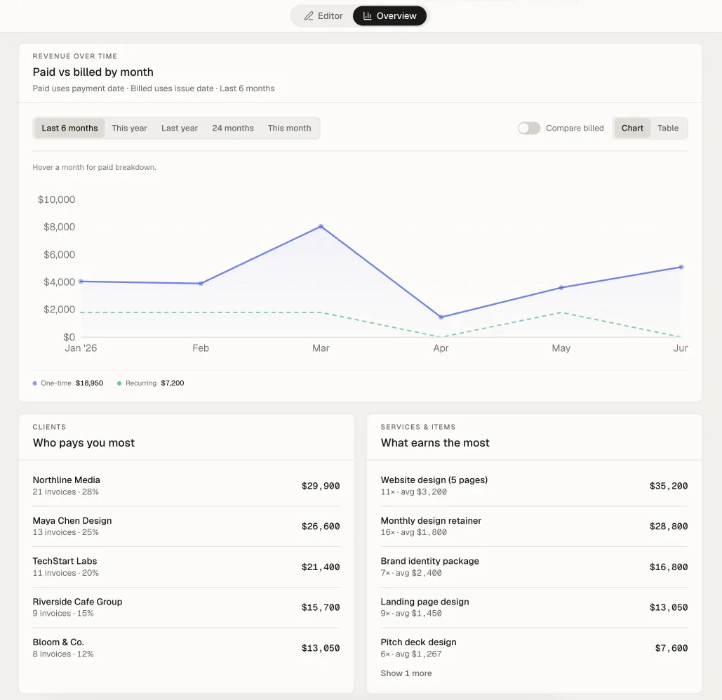
A billed vs paid over time chart complements Overview without overcrowding it. Freelancers can see cash flow patterns without a separate spreadsheet.
Each workspace has its own sender identity: logo, sender details, payment fields, prefix, currency, default language. Free gets 1 workspace; Pro up to 10. Switch from the navbar; libraries and metrics are scoped to the active workspace.
Many freelancers run more than one business name. Scoped workspaces prevent client and invoice data from mixing across brands.
Blueprints on the canvas act as master schedules. New schedules start paused until the user activates after the checklist is complete. Occurrence invoices are child invoices; editing an occurrence does not change the blueprint.
Monthly retainers are a clear Pro use case. Separating blueprint from occurrence prevents accidental recurring edits from breaking the master schedule.
The /invoice-generator route offers in-browser PDF without sign-up, 10 invoices/month locally. After sign in, drafts can merge into the cloud workspace.
This is an SEO entry point and light onboarding. Not the brand identity, but a bridge to the full workspace.
| Layer | Choice | Reason |
|---|---|---|
| Frontend | Next.js App Router, React, Tailwind CSS v4 | File-based routing, server components, mature ecosystem for SaaS |
| Database & Auth | Supabase (Postgres, Auth, Storage, RLS) | Auth + relational data without building a backend from scratch |
| Hosting | Vercel | Fast deploy, GitHub integration, edge-friendly |
| Resend | Invoice and reminder delivery from the app | |
| Billing | Polar.sh | Pro subscription (Founding and standard) |
| Client-side generation | No server cost per export |
Email currently goes through Resend; I may consider Unosend later for cost efficiency as send volume grows.
NeatInvoice was built with significant AI assistance, a pattern I have used before on ImageTools.pro and Penasihat Hosting. Cursor for primary development, Codex for repetitive code and refactoring, Antigravity for front-end UI iteration.
AI sped up UI iteration and boilerplate, but product decisions (data schema, invoice lifecycle, publish vs sent, monetization) stayed deliberate and manual.
NeatInvoice is designed around a useful workspace first, with advanced delivery and automation capabilities available as the product evolves. The product decisions are intended to support real invoicing workflows rather than create an artificially limited demo.
Overview and view tracking are positioning decisions, not features deliberately locked to force upgrades.
Positioning matters more than feature count. NeatInvoice wins on post-send clarity, not on stacking features.
Separate brand from SEO funnel. /invoice-generator and the workspace are two products on one domain. Their identities must not blur.
Two screens are enough for daily billing. More navigation does not automatically mean better.
Publish and Sent are different concepts. They must be designed and communicated clearly because they directly affect reminder and tracking expectations.
Local-first makes sense for a daily editor. UI responsiveness matters more than aggressive real-time sync.
An honest Free tier builds trust. The invoicing market is already tired of trial fatigue.
Calm design is a feature. For financial documents, trust comes from restraint, not decoration.
NeatInvoice shows how I approach SaaS product builds at Harun Studio: start from a clear problem, hold positioning tightly, keep design disciplined, then execute technically without over-engineering.
If you have a web product idea or internal platform in mind, we can help from needs audit through execution:
Live product: neatinvoice.app. Public roadmap at neatinvoice.app/roadmap.

Founder of Harun Studio, web developer, blogger, and hosting reviewer. He helps business owners build healthier websites through design, development, and long-term maintenance.
Explore more insights that connect closely with this topic.
CASE STUDIES My experience building ImageTools.pro, an online image processing app powered by Next.js, Sharp.js, and Shadcn UI, and how AI changed the way I build web apps.
Read Article CASE STUDIES
 A case study on the migration of Penasihat Hosting: from a WordPress setup that was actually still solid to Next.js 16 + PostgreSQL for long-term flexibility, a custom CMS, tool pages, and a more scalable product foundation.
Read Article
I transformed an HTML site designed by the MSI Freight team into a custom WordPress website with the same design, 13 pages, 32 migrated articles, and 346 redirect rules.
Read Article